sf-card 卡片视图组件
sf-card 介绍
将信息聚合在卡片容器中展示;
参照Element-UI官方文档
https://element.eleme.cn/#/zh-CN/component/card
sf-card Attributes
| 参数 | 说明 | 类型 | 可选值 | 默认值 |
|---|---|---|---|---|
| header | 设置 header,也可以通过 slot#header 传入 DOM | Object | — | - |
| bodyStyle | 设置 body 的样式 | Object | - | - |
| shadow | 设置阴影显示时机 | String | — | - |
sf-card 使用
<template>
<div>
<sf-card
:body-style="bodyStyle"
:header="headerInfo"
shadow="hover"
>
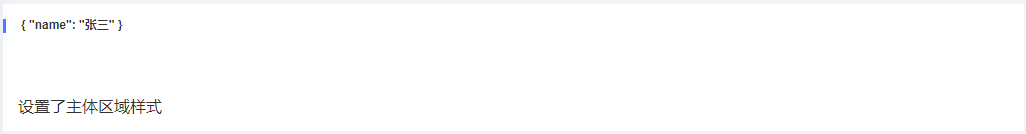
设置了主体区域样式
</sf-card>
</div>
</template>
<script>
export default {
data() {
return {
headerInfo: { name: '张三' },
bodyStyle: {
'margin-top': '50px'
}
}
}
}
</script>
效果展示